01 · House · January 2026
The Accent Is The Point
Why a single diacritic carries the whole house — and why it tilts the way it does.
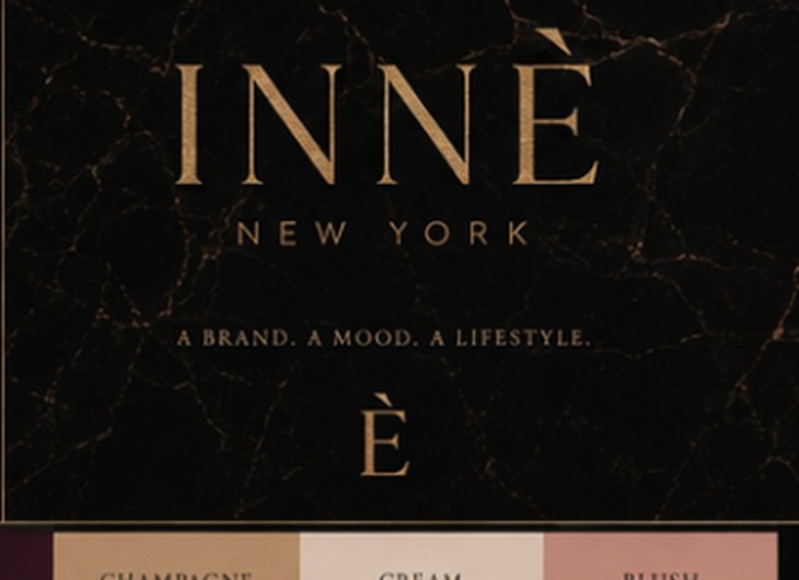
INNÈ begins with a sound that most languages already know how to make and almost none know how to spell. The accent grave is not decoration. It is the instruction: the weight falls here, on the last syllable, on the way out.
We drew the È more than four hundred times before we kept one. The serif had to be sharp enough to read as tailoring and soft enough to survive embossing into lambskin at four millimetres. The accent had to sit at fourteen degrees — enough to feel like motion, not enough to feel like a mistake.
That angle became the house geometry. It is the cut taken off the corner of every card, every panel, every image frame on this site. When you see a corner clipped at fourteen degrees, you are looking at the accent, scaled up and turned into architecture.
The rest of the identity is deliberately quiet. One serif. One sans. Black, ivory, oxblood, champagne. A house does not need a loud voice when it has a correct one.
A mark that leans is a mark that moves. Everything else in the house is still.
Continue